Healthwise by WebMD Ignite
Optimizing design system for client branding integration

Contribution
Led UX/UI design & research for consumer team
Set product design strategy for brand settings team
Managed design projects for two contractors
Tools
Figma
UserTesting
Jira & Confluence
zeroheight
Mural
Microsoft Teams
Duration
8 months
About the Project
Evolving Design Requirements

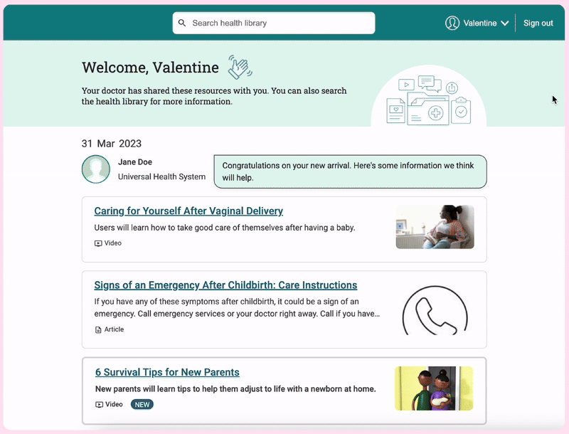
Fig. Brand settings application on desktop with live preview of branded consumer application on mobile.
This project aimed to address the evolving needs of our clients, who sought a fully branded experience with their patient health portal. As a B2B2C company, integrating our consumer application seamlessly into our clients’ systems was important to reflect their brand identity and establish trust. The design needed to be flexible and modular, facilitating easy customization while maintaining a cohesive user experience across our suite of products. Providing clients with control over their brand identity and customer experience enables them to provide a cohesive user experience, leading to greater customer satisfaction and trust.
Branded Products
5
Clients
~30
Consumer End-Users
19 million
Problem
Healthwise products lack a centralized solution for clients to brand their applications. This fragmentation requires manual branding across multiple environments. If a client licenses 3 products, then the client and Healthwise administrators have to manually add basic branding to 3 different environments. All of this leads to disjointed experiences, style inconsistencies, and increased workload for both clients and Healthwise teams.
Solution
Three pronged approach:
Consolidate brand customization and integration onto a single platform.
Phased roll out of brandable consumer-facing products.
Scalable solution incorporated within design system for current and future Healthwise offerings.
Process
Many Diamonds with Feedback Loops
Client Facing Strategy
Discover: Conducted extensive client & stakeholder interviews to understand branding requirements and pain points.
Define: Developed a client-facing strategy through research and requirement definition, leading to the creation of the Brand Settings Admin App.
Product Solutions
Develop: Brainstormed solutions to enhance the existing consumer-facing application, incorporating feedback from user testing and validation.
Deliver: Analyzed the impact on our design system and set the direction for future consumer-facing solutions.
Design System
Develop: Refined and iterated components based on feedback.
Deliver: Trained and onboarded teams to adopt revised components.
What is White Label Design?
White label design offers clients flexible and customizable user experiences that seamlessly integrate Healthwise’s suite of products into their existing platforms while maintaining consistency with their own brand image and style guidelines. This includes customizable color schemes, typography, and UI components.
Why this approach?
Before diving into branding individual applications or modifying the design system, we needed to take a step back to evaluate the broader Healthwise landscape. By focusing on the chronic problem of disconnected product experiences rather than symptoms, I was able to lay a more solid foundation for all downstream work while incorporating feedback loops to maintain an iterative and agile mindset.
Client Facing Strategy \ Discover
Exploratory Research
Client Interviews
Interviewed 10 clients to better understand their desires for product enhancements including their branding requirements. Discovery team wanted to better understand how clients brand and implement our products within their environment and how we can better support them.
The accompanying chart illustrates the number of clients who provided feedback to the use case of branding applications. Impact score was calculated based on client feedback & competitive analysis.
As a marketer, I want the consumer applications to be branded to my organization's style, so that it looks like it's ours.
Impact score*
3.8
*Out of 5. The problem often occurs and is a significant concern. Solving would have a significant positive impact on client business.
Stakeholder Interviews
Interviewed 3 product teams with 5 products utilizing the design system to better understand their key business objectives, solutions they have tried before, and the scale of the problem. I worked closely with our product teams to understand their unique branding needs. The objective was to not only gather product branding requirements but to also surface any style inconsistencies so that we can ultimately achieve style alignment.
The accompanying image showcases a high level view of branding requirements by product. Starting with this broad perspective of which products need what and when, we were then able to drill down into the specifics of variables and the CSS code.

Client Facing Strategy \ Define
Shaped the Design Strategy
Key requirements
No-code solution : Client admins who do not have coding experience need to be able to create & apply custom branding.
Limited number of customizable elements : Help clients minimize accessibility risk divergences and save time.

Design Vision
A dynamic color scheme that cascades and propagates automatically throughout the entire consumer application. Theming selection for phase 1 includes primary and secondary colors, font family, logos, & vanity URL.


Why choose this approach?
Provided the right amount of flexibility and control for clients.
Pulls variables from the existing design system.
Easy to add more advanced CSS & code based solutions in future phases.
Propagation of themes to multiple applications

Low-fidelity concept

Handoff
Once the teams aligned on branding requirements and the brand settings team was onboarded, I turned my attention back to the Consumer Application. With the discovery knowledge in tow, I had a better idea of what needed to be changed within the existing Consumer Application.

Consumer Facing Solution
Cobranding logo display
Key Question
How do we optimally display client and Healthwise logos?
Key Findings
Frequency - User’s liked to see logos on initial screens for confirmation that they landed in the right place. However, we found that logos on secondary pages to be distracting from the user’s primary focus of reading content.
Proximity - Displaying a health system’s contact information with a client logo helped users know whose contact information is displayed.
Validation
I conducted multiple rounds of A/B/C preference and usability tests throughout the building of the consumer application to determine the best placement and styling of client and Healthwise logos.

Header with client logo

Footer with cobranding
Consumer Facing Solution
Color adjustments
Key Question
How do we approach the application of colors to optimize for brand ingestion?
Key Findings
Dynamic color system - Optimizing for a dynamic color system allowed for easier automation of color assignments.
Tonal palettes - User’s preferred lighter/airier colors for the experience. However, when using only 2 or 3 colors on the page, our users had trouble discerning important elements. Tonal palettes allowed for us to create just the right amount of contrast for our consumer users while relying on the dynamic color system.
Validation
I mocked up a few theme variations and tested for preference and usability with users. Users preferred the lighter/airier colors in the experience over darker shades. When using only 2 or 3 colors (black, white, primary), users had trouble discerning between important elements.
Before - Original palette

After - Tonal palette

Consumer Facing Solution
Illustrations
Key Question
How do we visually communicate the context of the site to our users?
Key Findings
Content - Users craved context from illustrations to ground them in the experience. However, they found too much medical illustration to be distracting & overwhelming.
SVG - Exporting images as SVG and modifying colors within CSS works well with the new dynamic color system.
Validation
In early user testing, users had mixed opinions on the illustrations that were being used throughout the site. Users reported that some illustrations felt out of place, too abstract, or too busy. We hired a contractor to help with the creation of illustrations that strike a balance between calm and informative.

After - Updated illustrations with tonal palette
Before - Original illustrations with original palette

Delivery
Added Brand Settings App to Centralized Client Platform

Impact on Design System - coming soon
Lessons & reflection - coming soon