
Fig. AI Self-Portrait. Generated by AI
Healthwise by WebMD Ignite
AI-Driven Patient Education
Transforming Content Accessibility and Boosting Conversion in a Self-Serve Patient Education Library

Contribution
Discovery research
Ideation & conceptualization
Wireframing & prototyping
User testing & validation
Meeting facilitation with stakeholders
Tools
Figma
UserTesting
Jira & Confluence
zeroheight
Mural
Microsoft Teams
Duration
7 months
Gif. Demo created for conference presentation.
About the Project
AI Health Assistant
Healthwise partnered with Orbita (third-party) to develop a chatbot trained on a limited set of patient education content, ultimately enhancing self-serve search for patient consumers. The objective was to streamline information retrieval, expand access to multilingual users, and improve user engagement. The chatbot was added to an existing digital health library called Knowledgebase which is available to consumer patients within patient portals and payer/provider websites. By leveraging Orbita's expertise in conversational AI, Healthwise aimed to provide users with on-demand, personalized health information, ultimately fostering informed decision-making and enhancing trust with their providers.
Trained on
35,000+ articles
Available in
20 languages
Expected reach
19 million users
Problem
Clients reported health access gaps within multilingual communities. They want to expand their reach by providing content and care to patients in languages beyond English & Spanish. Currently, the manual translation process at Healthwise is resource-intensive and time-consuming. This access gap lowers the impact of the Healthwise mission and Health Equity, Diversity & Inclusion (HEDI) efforts.
Solution
By partnering with Orbita to leverage their expertise in AI, machine learning, and machine translation, Healthwise was able to provide more content in multiple languages at a much lower cost. This initiative included the implementation of machine-translated content and the integration of a multilingual chatbot directly within an existing patient consumer site.
Design Process
Double Diamond for Minimum Viable Product (MVP) Delivery
Discover
Learn the problem
Define
Narrow the focus
Develop
Brainstorm solutions
Deliver
Implement solution
Discovery \ Clients, Users, & Competition
Exploratory Research
Client interviews
With the PM, we interviewed 8 clients to learn about their multilingual requirements. We wanted to better understand how they implement our products within their environment and how we can better support them.
Findings
5 trial languages identified - Based on usage data, 5 languages for a machine translation trial were identified: Arabic, Haitian Creole, Portuguese (Brazil), Vietnamese, and Simplified Chinese.
Low trust of AI - 3 clients reported low trust and desire for machine translated content due to liability concerns.
Competitive landscape of patient education language availability
Comparing language offerings of competitors showed a major differentiating opportunity for Healthwise (HW). Only one competitor (c4) offers patient education content in 20 languages.
Site usage by Spanish speakers
Since the Knowledgebase is already available in Spanish, I worked with the analytics team to review usage data to better understand current behaviors.
Findings
Mobile first - 73% of users accessed the site by mobile device using predominantly Chrome or Safari browsers.
Switch back and forth - Users often switch back and forth between English and Spanish UI.
Persona development
I led the team in a facilitated meeting to create persona cards based on decades worth of consumer user research including historical usability testing of older products, in-depth interviews with patient consumers, interactions with clients, and comprehensive knowledge accumulated within the company. For this body of work, we focused our effort on the following personas:
Acute consumer
Chronic consumer
Caregiver consumer
Wellness consumer
Living my life consumer
Self-diagnosing consumer
Discovery \ Education
Learned How to Design for AI
Alongside the team, I conducted a comprehensive review of best practices for building AI solutions. My focus was on UX heuristics. I worked closely with content strategy to create a compilation of guiding principles and content readability goals to ensure alignment with industry standards and user expectations. I referenced literature from trusted sources (i.e. NNG AI Research & Google AI Research) to establish clear design objectives and criteria for evaluating the chatbot's performance. This effort involved conversations with content, devs, and PMs to share knowledge and find ways to “speak the same language.”
Guiding content principles
The goals for UI copy within the chatbot integration emphasize care and respect for the user.
Keep it simple - don’t overwhelm or confuse users with too much content or too many choices.
Plain, personal, possible - easy to understand health content to support behavior change.
6th-grade reading level - all Healthwise content is at a 6th-grade reading level, so AI responses should match.
Guiding UX principles
I applied UX heuristics to the analysis of AI design. This effort not only facilitated a deeper understanding of UX among team members, but also enabled us to create action items and research questions for further investigation.
Heuristic
AI is used to solve user's problems
Research Questions
What problems could an AI chatbot solve for our consumer users?
How might we improve the way consumers get to information that is relevant to their specific health concerns?
Be transparent about the system
What are the limitations and capabilities of the system?
Match the Mental Model
What do users need/want to know about how the system works to understand and use the product?
Why is this knowledge useful to the users?
Which mental models are they carrying over to our experience?
What are their steps to do x and how consistent are they?
Fail Gracefully
What are some typical system errors that can occur?
What would users consider to be a failure or an error? (mental model)
What are some contextual errors that could occur?
What are the stakes of a poor response?
What are some steps we can offer to users?
Discovery \ Initial implementation
Lackluster Out-of-the-Box Solution*
*no offense
Fig. Flow of initial implementation implemented by 3rd party partner
In order to assess the capabilities and limitations of the chatbot, the devs created a test environment for the out-of-the-box solution, allowing for the rest of the team to engage directly with the new feature. I spearheaded the benchmark user testing and stakeholder interviews to better understand and align our goals, objectives, and desires to that of our end-users.
By deploying this initial, less than perfect solution, our team gained valuable insights into user behavior, preferences, and mental models. We were better able to understand the challenges and limitations of the technology.
Benchmark user testing
Six subjects
Adults aged 18+
Average web expertise - desktop & mobile
Subjects were tested on qualitative and quantitative metrics. They were asked to perform a series of tasks including asking the chatbot two different health related questions. Goals of the test were to:
Understand users’ mental model, preferences, and expectations of AI
Obtain baseline ratings for response quality and UX/UI design
Main findings
No contextual carryover - No context retention, led to disjointed interactions, impacting user expectations.
Poor response quality - Responses varied widely in quality, resulting in overall limited usefulness.
Invisible features - No users located the suggested prompts behind the hamburger menu. Suggested prompts also not related to Healthwise use cases.
WCAG concerns - Implementation within the site posed some accessibility problems in initial QA testing.
Quotes from participants
“The responses aren’t very good. They seem very robotic and then they’re just sending you to a link.”
“…at the point where it sent me an arm article [after asking about a leg], that’s where I would’ve been like, okay, done with a chatbot….obviously now it’s time to speak to a professional...”
“It’s lacking a human quality... it feels like this is a pre-MVP bot. It’s just got a lot of work that’s needed.”
Baseline measurement of response quality did not meet company set goals
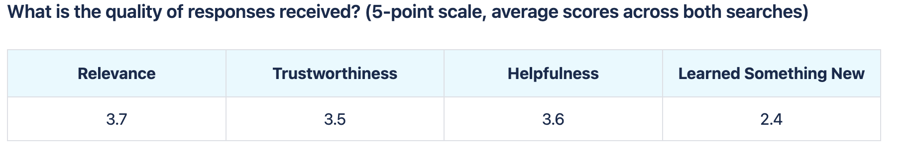
Baseline measurement of UX quality did not meet company goals in 5 categories
Definition \ Use Cases & Priorities
Set Priorities for Launch with Stakeholders
Fig. Whiteboard activity to identify personas, goals, & use cases
I led the meeting with stakeholders to identify personas, goals, and use cases. We grouped use cases based on themes and matched them to goals to reach alignment on vision.
Fig. Whiteboard Prioritization Matrix Stakeholder Activity
Use cases and goals were then used as guidance to brainstorm ideas and opportunities. Ideas were then placed on the matrix and priorities were identified. The focus was defined. We chose to build the items in “low-hanging fruit” and “best bets,” first.
Response quality priorities for launch
Response temperature
Temperature set to 0. Least likely to “hallucinate.” Lower temperatures responses are conservative while higher temperatures have a higher possibility of “hallucinating.”
Number of documents referenced
Reference 3 documents to form generative responses.
Generative answers vs. snippets
Use generative answers, not snippets. Benchmark testing showed that users desired more information and content from responses.
UX/UI priorities for launch
Chatbot
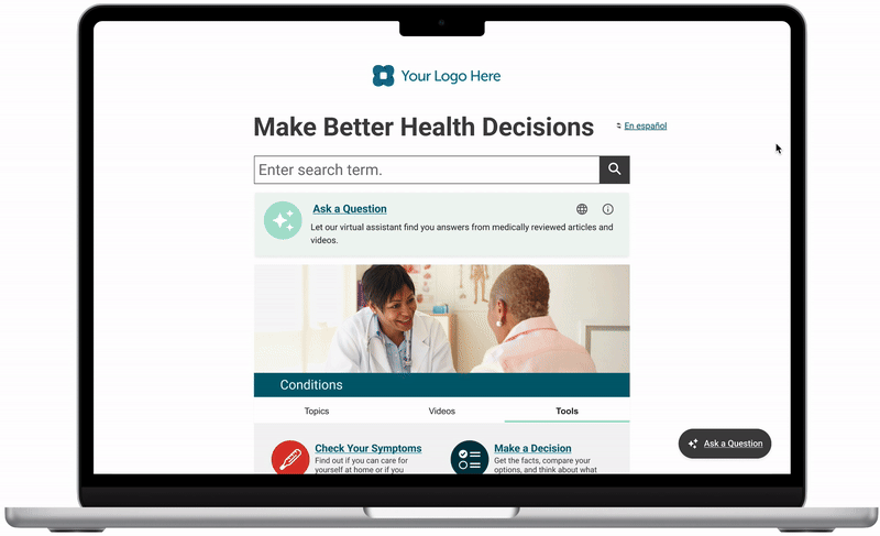
Chatbot icon-button persistent throughout site. Display chatbot feature card on homepage.
Enhanced search
Display an AI summary within search results page.
Multi-language control
Provide users with a way to select one of the 20 available chatbot languages.
Definition \ Flows & Prototypes
Flow and Prototype Version 1
Fig. Consumer user’s journey through the site to get an answer from the chatbot
Using the information obtained in discovery, I created a flow of the user’s journey that was then presented to stakeholders for feedback. Once we agreed on the flow, I used Figma to create the prototype below.
Gif. Mobile, high-fidelity, chatbot prototype
Design decisions
“Try asking” prompts to help teach users how to generate meaningful prompts within this chatbot. I turned the top 5 common search queries into prompts that a user can select from.
Branded colors and typography to match the existing consumer site style. Using the same CSS attributes allows for easier ingestion of client branding in white label offerings.
Global language select guides users directly to the chatbot upon language switch. Since we could not translate the entire site into 20 languages, it was important to be transparent with users about availability of features.
Limitations and capabilities included to provide users with guidance so that they can learn more about how the system works and protects them in high-risk scenarios.
User Testing
Show-Stopping Issues Identified
About the test
I tested the version 1 prototype above with 6 users from UserTesting on mobile and desktop. I conducted one usability test to see if this design addresses the problems discovered within the benchmark testing. Since this was a prototype, we weren’t able to test the quality of the responses.
Participants: 6 users from UserTesting
Prototypes: Mobile and desktop
Focus: To evaluate design and usability enhancements
Limitations: Non-functional prototype - unable to test response quality
Main findings
Unexpected Behavior - Desktop users expected to find the chatbot in the search, when prompted to open the chatbot.
Unclear Terminology - “AI” in Roboto font is confused for “AL” or a type-o for “all.” Is it chatbot or AI?
Improved Credibility - Including source links improved credibility of the premade response.
Suggested prompts - “Try asking” prompts were liked by the users and better informed their mental model for what they could do.
Multi-language control - Users had no problems finding and switching between languages.
Show Stopping Moment
Users did not differentiate site content from AI content
Users did not differentiate the embedded AI summary from the search results. This has the potential to significantly lower overall credibility of our medical content. Presenting warnings above the search results made users weary about all of the information on the search page.

Users rated the prototype chatbot more positively than the benchmark across 5 categories.
Benchmark avg. score
3.2
Prototype avg. score
4
Increase satisfaction
25%
The UX company goal is to get ratings equal to or greater than 4. Increase in the rating indicates to me that we’re on the right track.
Develop \ Brainstorming
Time to Pivot - Rapid Prototyping with Stakeholders
I asked stakeholders to help me address the show-stopping issues identified in the AI Search Summary design. We needed to differentiate search results from the AI generated content. During this collaborative session, stakeholders contributed valuable suggestions, leading to a pivotal moment.
Team proposed ideas:
Opt-in to receive a summary for search
Create a design that is visually distinct, don’t make it look like it belongs
Place the summary at the bottom of the page
Collapse the section into an accordion
Fig. Rapid prototyping activity with stakeholders
Fig. One chatbot user flow explored with the team.
Pivotal solution
Among the ideas proposed, one stood out – get rid of the AI search summary. Though it was proposed in a lighthearted manner by the development manager, I kept the idea on the board.
While refining the prototype, I struggled with designing a seamless integration of the AI summary into the search results. The whimsical notion of discarding the summary persisted in my thoughts. How can I get rid of it while still tying AI into search? Asking this question allowed me to come up with a transformative solution:
Append the feature to the search typeahead!
Fig. Exploration of an idea proposed by a stakeholder
Deliver \ Final Flow
Final MVP Solution
Fig. Flow. All Roads Lead to the Chatbot
Why this design?
Simplified design: Created an experience that is easier to navigate and understand. Higher potential for adoption and content convergence.
Simplified development: Less to build for an MVP solution and met product leadership desires. Less to maintain and less risk of creating technical debt.
Reinforced user expectation: Repetition of UI copy, iconography, and interactions reduces the user’s cognitive load by providing predictability within the elements.
Enhanced existing search: By catching users earlier in their search flow, we bridge functionality gaps within our existing search. Particularly for queries with no or limited results. It enables the intake of natural language & multilingual queries, a functionality our current search system cannot accommodate.
Deliver \ Implementation
Collaboration with Developers
Collaborative approach
Worked with the engineers from Orbita and Healthwise to define roles and responsibilities. We worked together to determine who is responsible for each piece of the chatbot. Clear guidelines and communication ensured consistency and alignment with the overall design vision.
Detailed design specifications
I created design specifications, including mockups, style guides, and documentation to guide developers in the implementation of design elements. These specifications, based on the Healthwise design system, included white label integration guidelines to ensure alignment with Healthwise branding standards and client requirements.
Quality assurance and refinement
I conducted manual quality assurance (QA) testing to ensure the integrity and functionality of design elements within the production environment. I collaborated closely with engineers to iterate on design refinements, incorporating stakeholder feedback and addressing any issues to meet quality standards.

Fig. Stylesheet submitted to Orbita engineers.
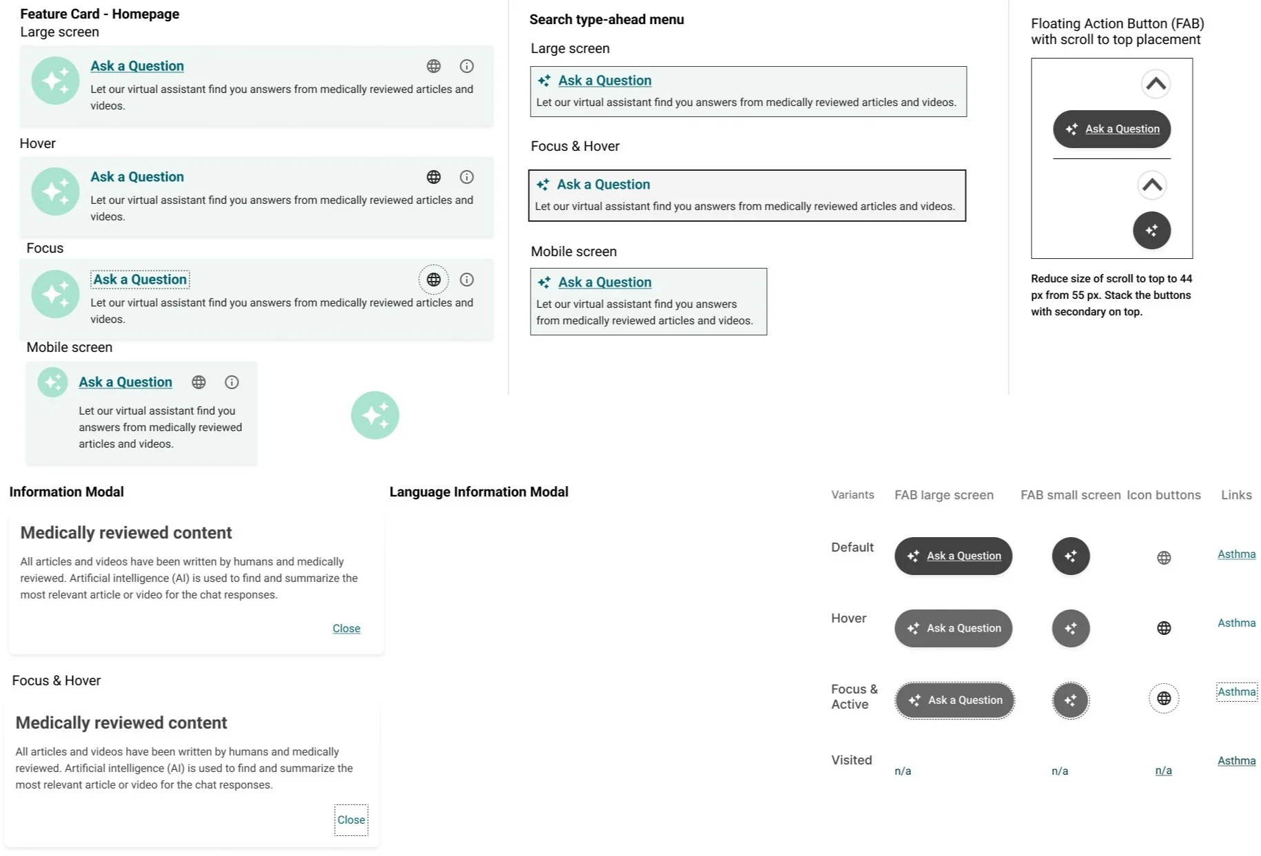
Fig. Component design specs for Healthwise engineers.
Deliver \ Final Prototype
MVP Prototype Impact
Accomplishments
Expanded language offering: Expanded accessibility of Knowledgebase content to 20 languages through the AI chatbot. Previously available only in English & Spanish.
Improved search experience: Enhanced the search experience by offering users the ability to ask questions directly within the search bar leading to users to get the information that they need when they need it.
WebMD acquisition: Positioned the company to be purchased by WebMD. One of the products that they retained and plan to continue to develop.
Next Steps
Sprint 2 - MVP+ Next Steps
High value future improvements
Contextual carryover
Allow users to ask a series of related questions on the same topic and have the bot infer their meaning based on context from the last several questions.
Decreasing response load time
Load times are currently 10-15 seconds, much too long. Need to reduce.
Content types as sources
Identify which content types are appropriate to display as a source and which can be referenced but not linked to a response.
High-risk scenarios
Determine which content subjects need standardized language within a response such as mental health, first aid, and when to seek care.
User testing & usage monitoring
Response and source quality
Interview users on the response quality of the chatbot. Identify ways to monitor success - perhaps integration of response ratings.
Common attributes of user queries
Identify the common queries submitted by users in order to learn how to better address their needs.
Chatbot vs search typeahead integration usage
Measure the success of the pivot from search summary to search typeahead, does it actually address the needs of the user?
Multi-language use
Continue testing with multi-lingual users to better understand their expectations for the site. Do they prefer a global language select or in-feature language select?
Reflection
What worked?
Solid discovery & collaboration
Setting content and UX guidelines at the start allowed for the team to speak the same language while collaborating towards a solution.
Rapid prototyping pivot
The embedded search results were a show-stopper that required creative problem solving. The rapid prototyping session led to a major pivot that ended up addressing a much larger product problem we’ve had for years.
What was challenging?
Limitations of the bot
With no contextual carryover and often subpar response quality, it often felt like “putting lipstick on a pig.”
WebMD acquisition
The acquisition brought the project to a halt. I was unable to take the product to the desired level that I would have liked to.