
FormAssembly
FormAssembly is an enterprise class, form management tool where people can create and manage their forms and responses. Working closely with the CEO and the development team, I redesigned a portion of the FormAssembly platform called My Responses. This part of the site allows for our customers to interact with the submitted responses.
-
Key Outcomes
Fully redesigned the form reporting UI to meet the need of users.
Created and utilized a design system that could be used to update other parts of the FormAssembly product.
-
Project type
UX/UI design
User research
Information architecture
Data visualization
Design systems
-
Tools
Sketch
Invision
Pendo
-
Duration
1 year
Process
Main Milestones

Background
Form building
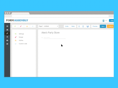
In order for users to get responses, they need to build a form.
In 2016, I redesign the form building experience. By leveraging client and customer feedback, conducting user testing, and collaborating closely with the CEO and development team, I aimed to create a more intuitive and user-friendly platform. By focusing on usability and aligning the design with user needs, I successfully delivered a streamlined and efficient form building process that empowers users to effortlessly collect information from their own users.
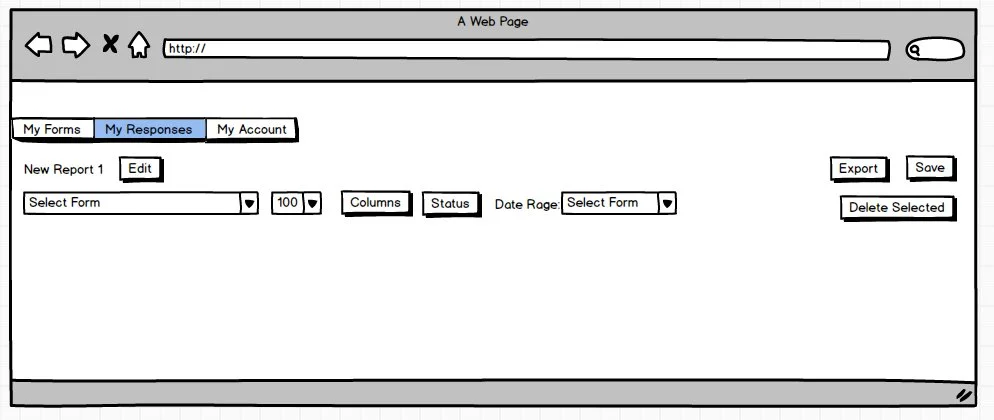
Problem
Main Pain Points with Response View
The following pain points were gathered from costumer interviews and consumer voice collection tools.
Table only displays first three form fields
Our customers often build long forms with many form fields. By displaying only the first three fields, they are unable to see the entire response without opening each individual row.
Limited mass actions
Customers often receive responses from hundreds of people for each form. The responses submitted can exist in a number of states like incomplete, unread, flagged, and so on. Our customers have trouble not only accessing all of these states but committing mass actions to them.
Too much information on the screen
The layout of the information is overwhelming with no clear focal points.

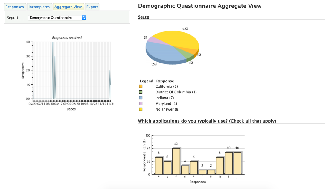
Problem
Main Pain Points with Aggregate View
Charts are not visually engaging
The visual effects applied to the charts, like the drop shadows and the 3d pie chart make the charts look outdated.
No ability to control the data displayed
All charts and data are presented based on defaults without the ability to hide certain types of data.
User Research
Identification of Key User Actions
Data used to craft personas, use cases, & user flows:
Customer interviews
Customer success team feedback
In-app voting data
Product analytics
Use cases by persona
Based on costumer interviews, customer success team feedback, and in-app voting, use cases were constructed to identify all of the existing and potential features within the product. The use cases were prioritized and used to construct flow diagrams and a product road map.

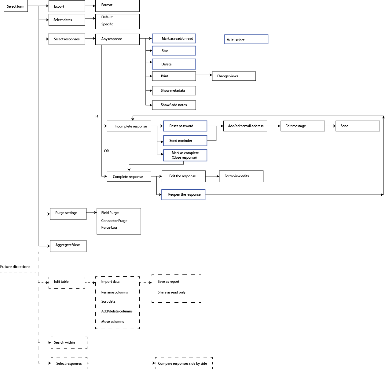
User flows
Using the use cases, I created a flow diagram for the MVP and scalability for future directions. This flow chart was used to construct the wireframes.
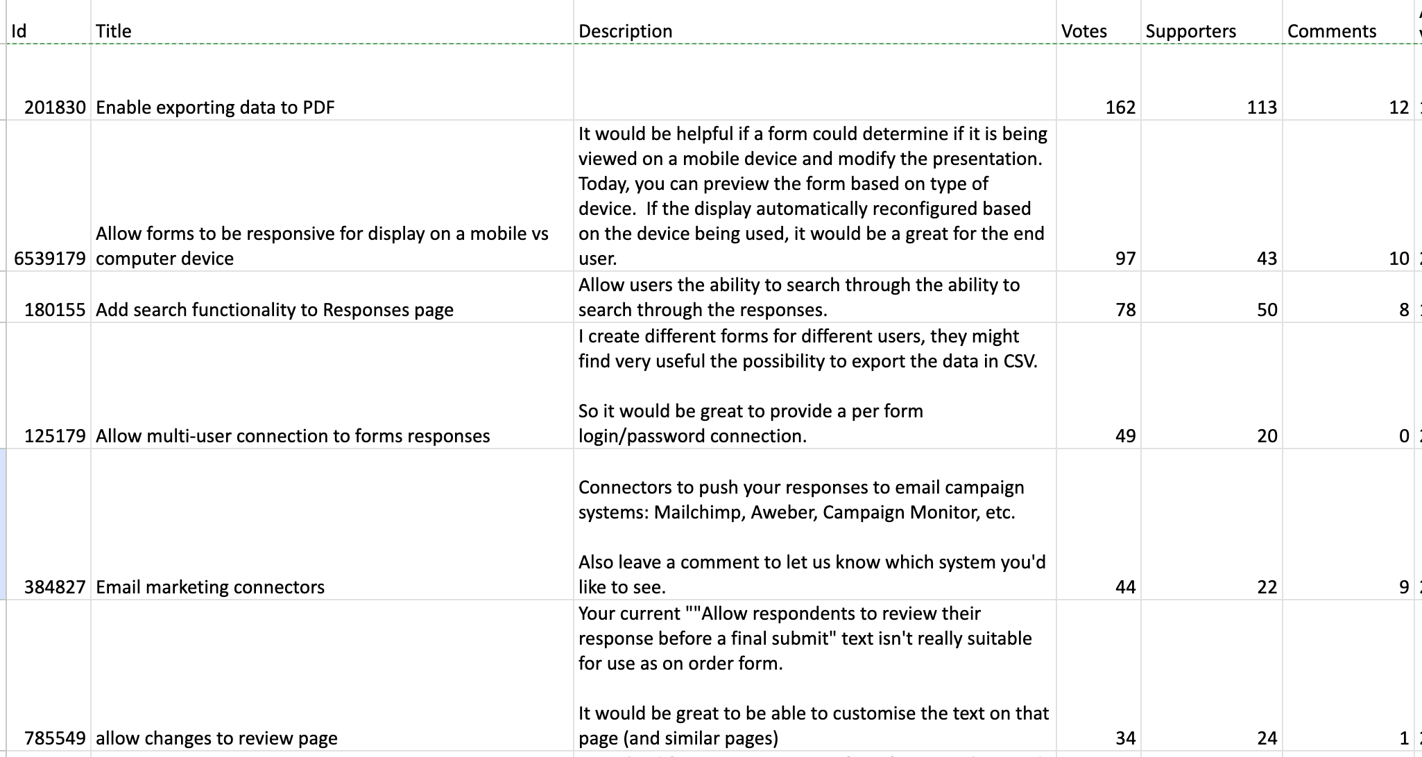
Fig. Top-voted suggestions for response view suggestions collected via consumer voice tools.
Prototypes
Evolution from Low-Fidelity to High-Fidelity
With countless of iterations to get to the final design, here are the major changes in the design direction. Initially, I sketched out the most important functions and actions that were currently available within the current design. Using Balsamiq, I transferred my hand-sketches to digital. Then, I applied the existing FormAssembly style and look to my initial sketches. Finally, we continued to narrow down on the style direction as we landed on incorporating the Salesforce Lightning Design into our product.
Low-fidelity to capture main interaction points
Updating the existing design with smaller changes
Overhauling the entire design for a fresh look

Dialing in on the style
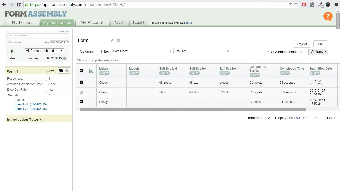
Final Design
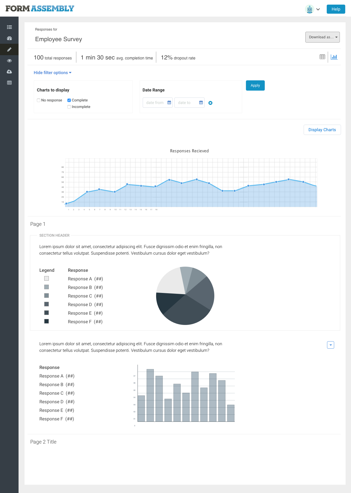
Response view
In the final design, we provided users with the ability to control which data to display by introducing filters and table columns. Users can now see all of the data that they want to see in one place.


Aggregate view
We simplified the chart display by utilizing a minimal design and also provided users with more data display controls. Users can now show and hide certain response types and control their date ranges.


Design system creation
Working with the front-end developer, we created a brand new design system for FormAssembly.

Key Takeaways & Reflection
I sat down with our marketing staff to discuss the major redesign of the product.
Hannah: What was the biggest challenge in the process?
Katya: The biggest challenge was working within our system’s limitations. The way that our back end system is constructed really limits what can be done on the front end. However, constraints are a part of design and I am up for the challenge to work with such constraints. Another challenge was making sure that my work maintained consistency in look, feel, and interactivity as Ben worked on the design elements. This challenge is the reason we started working on the style guide.
...
Hannah: What advice would you give to fellow UX folks who are getting ready to work on a redesign?
Katya: I have three pieces of advice:
Iteration is key. I created dozens upon dozens of full designs to small, specific feature designs. The evolution of the design is remarkable, but each iteration brings you closer to a better user experience.Since there are so many possibilities and directions to the design, as the designer, you need to just make a decision and just go with it. There just isn’t enough time to get feedback on every button and every interaction. And in any case, most people aren’t in the weeds like you thinking about every little detail.Don’t be afraid to make the wrong decision. Usually, mistakes are caught in testing and feedback sessions. They are early enough in the development process that it’s an easy and cheap fix.
Read more about the process here : The Gemini Redesign Journey (Part 3)